Dive into OOCSS principles
☕☕☕ 15 min read
I can haz OOCSS?
Consider a new web project: a start-up dreams of developing THE indispensable webapplication of tomorrow’s web. They choose wisefully technologies, frameworks, environments they’ll use… However, the front-end rendering will still the same for the browser: HTML, CSS and Javascript.
But here’s the thing: even if the whole application will probably take advantages of some frameworks, have a look over the stylesheet and you’ll probably get something like that, with or without preprocessor:
#form-generator {
  width: 760px;
  margin: auto;
}

#form-generator label {
  font-weight: bold;
  font-size: 12px;
  /* … */
}

#form-generator label.title {
  font-weight: normal;
  font-size: 11px;
  /* … */
}

#form-generator textarea {
  width: 350px;
}

#form-generator .big textarea {
  width: 500px;
}

/* a bunch of CSS */
This kind of code will cause a lot of hassles over time:
-
Lack of flexibility, it can only apply to elements which are contained in the form which gets the
#form-generatoridentifier. That could sound relevant at first, but what if you want to build other pages with some similars forms in it? -
Too much specificity, you have to overspecified again and again selectors when you want to create some particular cases. Just look at
label.title-titreor.big textareafor instance. -
Too complicated, you need to be an expert and know the architecture of every single page to dissect and maintain all of this mess. Plus, it would probably grow as the project develops.
If you add some messy organisation for CSS files, then you get a spaghetti code which would lead to a lot of troubles, errors, code duplication as new developers enters the ring over time.
This extreme dependency between the HTML structure makes the code be especially fragile: even if it’s clean, a simple mistake of a non-expert can ruined it completely.
In short, these non-mature practices will make things harder for the start-up and promises long sleepless nights of debug and refactor.
Finally, the problem here belongs to the 1:1 relation between CSS and the number of blocks, pages, modules of the website. As long as it grows, the stylesheet grows as well. That implies development time, and so money… We could do better in terms of ROI.

The Object Oriented CSS (OOCSS) bring its own solution to these problems. It’s nor a new preprocessor, nor a new language, but a code philosophy. It’s a set of best practices, rules and advices to help your CSS become scalable.
OOCSS has 2 principles :
- Separate structure from skin
- Separate container from content
1. Separate structure from skin
Usually, elements of a website have a visual aspect which is repeated in different contexts : colors, font, borders, … the graphic charter in a whole. This is the skin.
In the same time, a bunch of “non-visible” properties are repeated : width/height, overflow, etc. This is the structure.
If you separate them, you create re-usable components that can be shared into elements which have same properties. And so we speak about objects, which may sound familiar to back-end developers by the way.
2. Separate container from content
The deal here is not to stupidly constrain the style of an element (the content) to the its context (its container).
If you are designing titles, why limit yourself to those who are into the <header>, just because this is the only title place for now? Plus, it’s very likely that all your titles have a consistent design in your whole website for ergonomics concerns.
It’s even more true for modules.
Why is OOCSS good?
The 10 best practices
Here are the 10 best practices that are part of the OOCSS spirit:
-
Create a library per component
Each component - button, table, link, image, clearfix, etc. - should be a piece of Lego = combinable and re-usable as you wish. -
Use semantic and consistent styles
The style of a new HTML element should be predictable. -
Design transparent modules
The module is the container that could be used with any content. -
Be flexible
Height and width should be extensible and adapt themself - RWD inside -. -
Learn to love grids
Grids allow you to control width. Height is generally defined by the content. -
Minimize selectors
Keep a low specificity[0-0-1-0]to have a better control over selectors. -
Separate structure from skin
You must do the distinction, it’s a fundamental principle of OOCSS. Create abstract objects for blocks structure and use class to dress these blocks, regardless their nature. -
Separate container from content
You must do the distinction, it’s a fundamental principle of OOCSS. Create 1:n relationship separating the container from its content. -
Extend objects with multiple classes Class/objects are just like Legos you put together to build the expected result.
-
Use resets and YUI fonts
This is a specific choice of the OOCSS framework.
Legos first - A best practice is to design individual pages after having created basic components for the whole website.
The 9 pitfalls to avoid
Here are the 9 pitfalls to ban, according to the OOCSS spirit:
-
Create styles that depend on context
There is nothing less flexible but aarticle > p:nth-child(2) > span.plopselector. -
Overspecify selectors
div.my-classis uselessly overspecific as.my-classis sufficient enough. However, it becomes relevant if you want to override a class styling for some specific elements -strong.errorwill override the defaults rules of.errorfor this special use -. -
Use IDs
What an ID can do, a class can do better. Futhermore, IDs contribute in creating unexpected specificity mess. -
Use shadows and border-radius on irregular backgrounds
It could have unexpected results. -
Create a sprite containing every images, excepted if you don’t have a lot of pages
It’s not very optimal in certain cases as you need to deal with image rendering exclusively in CSS. -
Precisely adjust the height
An element height is controlled by its content. Separate container from content will make your life easier. -
Use images as texts
I guess you can reach a better accessibility level. -
Be redundant
Two components which that look too close to be differenciate on a same page look too close to be used on the website: choose one! -
Do early optimisation
Developers tend to waste a lot of time on the optimisation question when it’s not critical than to focus on what is essential to go on.
OOCSS benefits
As the project is going on, you will be able to create whole new pages combining existing elements without adding any CSS, even for a completely new architecture.
Re-use elements is also a totally free performance gain! You’ll create new elements with 0 line of CSS code, what could be better?
OOCSS force you to think the website as a whole instead of focusing on simple pages put one along the others. You should anticipate the future.
Finally, the main advantage of this philosophy IMHO is that it makes your CSS modular, easier to maintain. This modularity makes your CSS robust: a new developer would be less likely to break the design when working on it.
OOCSS, how does that works?
Gimme concrete examples!
Remember the 2 main principles:
- Separate structure from skin
- Separate container from content
With these good practices in mind, let’s see how to apply the philosophy on a daily code.
1. Separate structure from skin
Let’s take the favorite example over blog posts: buttons. A “classic” CSS would look like this, I guess:
#button {
  display: inline-block;
  padding: 4px 12px;
  margin-bottom: 0;

  font-size: 14px;
  line-height: 20px;
  color: #333333;
  text-align: center;

  vertical-align: middle;
  cursor: pointer;

  background-color: #d5d5d5;
}

#button-primary {
  display: inline-block;
  padding: 4px 12px;
  margin-bottom: 0;

  font-size: 14px;
  line-height: 20px;
  color: #ffffff;
  text-align: center;
  text-shadow: 0 -1px 0 rgba(0, 0, 0, 0.25);

  vertical-align: middle;
  cursor: pointer;

  background-color: #006dcc;
}

#button-large {
  display: inline-block;
  padding: 8px 16px;
  margin-bottom: 0;

  font-size: 18px;
  line-height: 28px;
  color: #333333;
  text-align: center;

  vertical-align: middle;
  cursor: pointer;

  background-color: #d5d5d5;
}

#button-activation {
  display: inline-block;
  padding: 8px 16px;
  margin-bottom: 0;

  font-size: 18px;
  line-height: 28px;
  color: #ffffff;
  text-align: center;
  text-shadow: 0 -1px 0 rgba(0, 0, 0, 0.25);

  vertical-align: middle;
  cursor: pointer;

  background-color: #006dcc;
}
<!-- The corresponding HTML -->
<a href="#" id="button">Default</a>
<a href="#" id="button-primary">Primary</a>
<a href="#" id="button-large">Large</a>
<a href="#" id="button-activation">Large Primary</a>In the end, you come with a lot of redundancy and a #button-activation which is nothing but a large version of #botton-primary.
If you refactor this CSS with OOCSS principles, you’ll get something more flexible:
.button {
  display: inline-block;
  padding: 4px 12px;
  margin-bottom: 0;

  font-size: 14px;
  line-height: 20px;
  color: #333333;
  text-align: center;

  vertical-align: middle;
  cursor: pointer;

  background-color: #d5d5d5;
}

.button-primary {
  color: #ffffff;
  text-shadow: 0 -1px 0 rgba(0, 0, 0, 0.25);

  background-color: #006dcc;
}

.button-large {
  padding: 8px 16px;

  font-size: 18px;
  line-height: 28px;
}
<!-- The corresponding HTML -->
<a href="#" class="button">Default</a>
<a href="#" class="button button-primary">Primary</a>
<a href="#" class="button button-large">Large</a>
<a href="#" class="button button-large button-primary">Large Primary</a>.button define the generic properties - the “defaults” ones - for our buttons. If you override it, you come with new classes that you can combine to get the expected result, just like Legos!
Here was the trick.
2. Separate container from content
It did happen, sometimes, that my code looked like this when developing the main design:
header h1 {
  font-family: 'Roboto', Helvetica, sans-serif;
  font-size: 2em;

  color: #f44;
}

/* a bunch of CSS */

footer h1 {
  font-family: 'Roboto', Helvetica, sans-serif;
  font-size: 1.5em;

  color: #f44;
  opacity: 0.5;
  filter: alpha(opacity = 50);
}
<!-- The corresponding HTML -->
<header>
<h1>Header Title</h1>
</header>
<footer>
<h1>Small title in the footer</h1>
</footer>Here again, it’s a fail: I am duplicating code, which is useless and I didn’t even notice that!
The elements I defined here are simply not re-usable. They directly rely on a specific container. But it’s clear enough that some properties are not specific to this container.
And so I may have consider the following alternative:
h1 {
  font-family: 'Roboto', Helvetica, sans-serif;

  color: #f44;
}

/* … */
h1,
.h1-size {
  font-size: 2em;
}

h2,
.h2-size {
  font-size: 1.8em;
}

h3,
.h3-size {
  font-size: 1.5em;
}

/* … */
.muted {
  opacity: 0.5;
  filter: alpha(opacity = 50);
}
<!-- The corresponding HTML -->
<header>
<h1>Header Title</h1>
</header>
<footer>
<h1 class="h3-size muted">Small title in the footer</h1>
</footer>You may think “Why should I care? We don’t really reduce code here!“. For sure that’s true here… if you only focus on the title.
But OOCSS makes you think further about the future of your website. Here we don’t just improved titles flexibility, but we add few new elements:
-
Each level of title has a standard and homogene
font-size. Each of thesefont-sizeis also set to an independent class and could be re-used, whatever the contextDoing so, you’ll notice that I didn’t choose the level of title because of the default sizing it would render on the screen: it’s better for semantics, for accessibility and SEO \o/
-
I created a
.mutedclass that allows me to mitigate the visibility/opacity of an element. I guess this little utility would be useful later and I’m sure I won’t have to duplicate that kind of code around in my CSS.
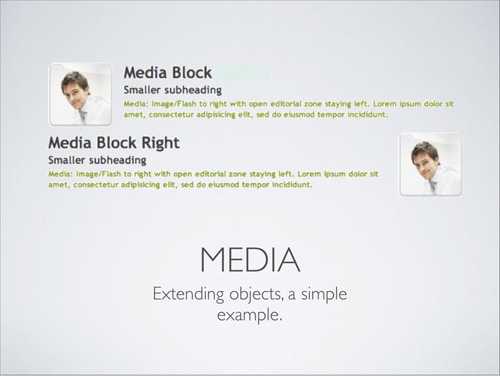
The media object
The most famous example which illustrate OOCSS is the media object created by Nicole Sullivan. It saves hundreds of lines of code.

It’s nothing but an abstract object which represents a media object - a picture, a video - aside to a media body - typically a text -, to its left or to its right.
It’s a typical scheme that is repeated everywhere. Think about the Facebook display.
Here is basically the module content:
.media,
.media-body {
  overflow: hidden;
}

.media-img {
  float: left;
  margin-right: 20px;
}

.media-img-rev {
  float: right;
  margin-left: 20px;
}

.media-img img {
  display: block;
}
<!-- Base structure for the media object -->
<div class="media">
<a href="#" class="media-img">
<img src="#" alt="#">
</a>
<div class="media-body">
<p>
Lorem ipsum dolor sit amet, consectetur adipisicing elit.
</p>
</div>
</div>These few re-usable lines of CSS will save a lot of time and help to improve performance over a whole project.
You’ll note that Bootstrap has implemented it, just like inuit.css, which is not that surprising when you consider these two frameworks use OOCSS concepts.
Harry Roberts has recently proposed the flag object which incorporates more or less the media object with the vertical centering concept.
Implement the OOCSS in your project
First of all, you need to understand and adhere to the philosophy. There is no absolute rule and best practices change as the web develop and evolve. Plus, you should always consider the context of your project and define what is good for you.
That said, we can sum up the implementation of an OOCSS spirit with some concrete practices:
- Don’t use IDs for CSS
- Don’t overspecify your selectors (
.errorand notp.error), excepted for overriding reasons - Avoid the use of
!important - Distinguish components of your project and create modules out of them
- If relevant, adopt a CSS framework based over OOCSS principles. I’d advice you to use Bootstrap if you need a predefined design ; inuit.css is you just need about structure and deal with the design by yourself. Note that the oocss framework from Nicole Sullivan exists as a reference.
Few comments
Good remarks and poor ideas
No need to say that these philosophy is a non-absolute vision of CSS that we could debate on.
However, we can point out the following things:
-
It’s absolutely possible to use IDs in HTML for JavaScript purpose, for instance. Moreover, identifiers could be useful as namespaces for a particular module that you want to share without breaking anything.
-
One of the arguments against OOCSS is that you are “polluting” HTML with a bunch of classes that some HTML-evangelist don’t appreciate, which is understandable. However, OOCSS doesn’t impact the HTML semantics.
-
OOCSS principles can perform miracles over big projects, where it worth to implement them. For little ones, it’s up to you! However, the philosophy is relevant regardless the size of your project and doesn’t take that long to be implemented than an ordinary development when you get used to it. Rather, modules you’ve already created for any other project could be re-used in a new one, you just have to change their design a bit and there you go!
Even if OOCSS is now a well-spread vision for the benefits it brings, I must say that I was suspicious when I read the assertion: “avoid the use of ID in CSS, ever”.
But since I understood the benefits of this practice, I warmly recommend it.
That said, as I get smacked for my code organisation, I now use IDs in my CSS in a unique place : the layout.
It’s just a matter of adaptation to your project needs and philosophy.
Another philosophy
Another vision of CSS give its importance to the context of elements.
It’s another philosophy, interface-oriented which considers that CSS is defined to design the existing HTML interface. To pollute HTML with classes is a non-sense when selectors and good code organisation can deal with the design.
Even though I don’t adhere to this practice - at least for a project which is meant to evolve -, it’s an interesting philosophy which could be relevant for small projects, for instance.
To go further
Posts and interesting links
Here is a list of links you may have a look to go deeper into OOCSS:
- An introduction to OOCSS, is an introducting post about this concept, by Smashing Magazine.
- The OOCSS perspective by Nicole Sullivan, or even the short version if you don’t have time.
- List of Nicole Sullivan’s blog post about OOCSS.
- Breaking Good Habits, speech from Harry Robert with the according slides.
- OOCSS & RWD to think about how the OOCSS can help to build responsive websites.
- CSSLint is a tool that will lint your CSS according to OOCSS principles.
Conclusion
Our little dive into OOCSS is now over.

Plop!